Analytics of 2024's Chasing Yellow Tour (and some tech fun)
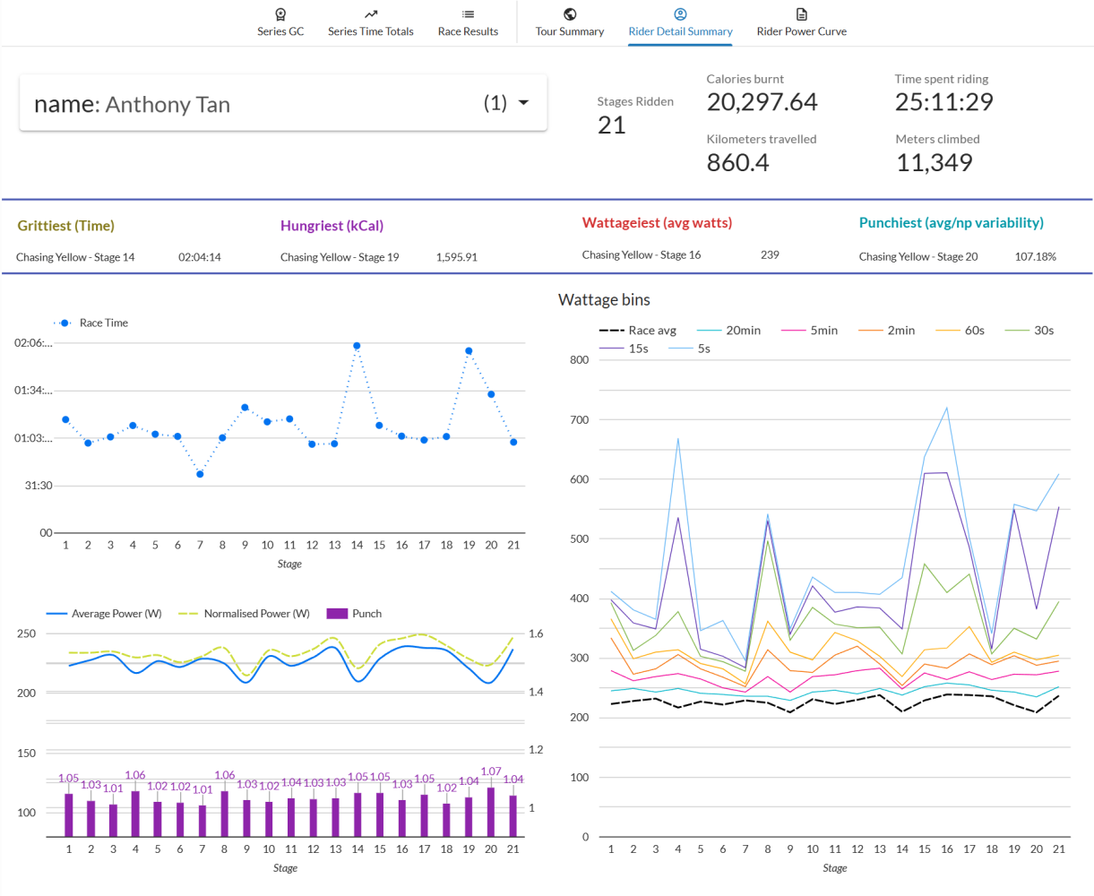
Want to explore the dashboard? It’s still live! Chasing Yellow 2024 - Which TdF rider am I channeling?
 Yeap.. those are actual aggregates from this years Chasing Yellow race, and data is fun, so this year I figure I’d stretch those glue-random-products-to-make-a-dashboard muscles to whip up these dashboards for our riders.
Last year I had done some hand compiling of stats and got so backlogged I couldn’t keep it going.. this year I went a bit more sensible and went full tech so could both maintain it better, and go into deeper/fancier charts. Win!

What the actual heck?
Cycle racing on Zwift basically. We match the calendar and route profile of the TdF (not the length luckily) and a bunch of us race it. Jonathan Morin is the responsible party and it’s one of the tougher cycle racing circuits I’m aware of - tough because there’s people with rip-your-legs-off-but-nicely power in the races as well as people who’re prepared to grind you down over eight hundred and sixty kilometres across twenty one days.
There’s a strong bias towards rewarding participation so it’s not like you have to do all or nothing.. but for those of us mad enough to try.. well, it’s there!
Analytic Outputs
There are three key analytic outputs I put together over the course of the tour and the end each with a slightly different set of challenges:
- TdF comparator - based purely on finishing position, which pro rider were our finishers channeling that day? What about in overall GC contention? Daily updates are needed here.
- CT Yellow Summary - as a collective, how mad are we again? Oh right. Got it. This is the straightforward mass-aggregation one.
- Rider stats - as a rider, I’d like to know calories burnt, power curve, distance ridden, time on bike, power curve for various wattage buckets. New for 2024 and mainly for post tour curiosity, and requires the most slice/dice/transform. So yeah, this was pretty much all built during racing, and I thought it’d be good to write this up as a brief exploration of the work involved because it’s been prettying interesting as a “huh, this is how you go from 0 to a thing quickly”.
Data Sources
Chasing Tour’s Race Organisation (i.e. Jonathan Morin) takes care of race specific data with time penalties, relegations and things like that. This is my primary store for rider positioning and what we call eGap which is used for ranking TdF day to day results from ProCyclingStats(PCS) because they’re super easy to read the data from and awesome. Race detail from ZwiftPower(ZP). This isn’t ideal but in lieu of a formal API we make do with what is essentially web-scraping.
Tech Stack
- Javascript/node.js forms the backbone of my raw data pull from PCS and ZP - it’s relatively straightforward to run up a clean OAuth flow and do lightweight data extracts;
- Python for gross JSON/HTML parsing and transform and loading into Google Sheets - there was a couple of test CSV dumps and local work in excel to check for processing bugs etc;
- Google sheets/excel as a lightweight, easily inspected and patched data source (data sanitisation.. ugh);
- BigQuery for proper scale, complex transforms, and lightweight data view generation;
- Looker Studio for the dashboard and visualisation core - honestly, this was the key win. There’s things I’d like to do that I can’t but a lot of those are at-the-edge cosmetics;
- Github pages possibly the quickest way to spin up some basic HTML and get it served globally. Thanks Microsoft! Better than copy-pasting links around.
Gluing it all together
Actually, it ended up being pretty simple:
- Every day during the Tour: Automagic JS/Node data pull in the morning to update the previous day’s TdF results into a google sheet. Looker connection just refreshes and the reports update, ez.
- At rest day + end of Tour: Another data pull to localise the relevant ZwiftPower race data, a local machine python script to sanity check and do some clean-up to then batch pushes to GSheets. During the tour this was the live feed.
- Post-tour (i.e. now) for the detailed analytics and slightly wacky transforms I’m in BigQuery near-exclusively - the dataset is now stable so I’m focussing on some of the pivot/collate/aggregate/view mangling required for Looker to present things the way I want. To speed things up, I’ve been handcrafting sample datasets in google sheets which are connected to Looker, letting me validate it works, which then lets me focus on writing correct SQL to do the view transforms. Super efficient once I worked it out actually.
Got any questions, want to know more about how the this all came together? Curious about detail? What worked, and what didn’t? Sling me a message and happy to explain, and be told there was a better way 😅 This post is a bit too long as it is…